BPMonline Introduced a Brand New Logo
In March 2013 BPMonline unveiled its new logo, introducing a brand new look for the company and its products.

In March 2013 BPMonline unveiled its new logo, introducing a brand new look for the company and its products.

It’s been almost two years since the company launched its brand new product BPMonline CRM. During this time the revolutionary solution that combined CRM and BPM approaches has already managed to receive the prestigious CRM awards and has helped many companies of different sizes and industries to automate and streamline processes.
Unlike the previous logo, the new one does not have capitals, it is straightforward and distinctive. The corporate colors remain the same as it should be clearly identified with the existing and constantly developing brand BPMonline
.
The update is timed to the second anniversary of BPMonline CRM. Furthermore, it is inextricably connected to the new look of the company’s products, which will come together with the release of new and significantly updated versions.
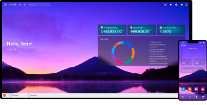
When creating the new logo, we aimed at making it look in line with a new revolutionary user interface for all BPMonline products, which we plan to release in Q2. The new consumarised UI is both user-friendly and highly functional. Changing the overall look of BPMonline products we consider that this is the perfect time to refresh our logo and image
, says Katerina Kostereva, CEO and at BPMonline.
The new logo has already appeared on the company’s website and in a bunch of marketing materials.


